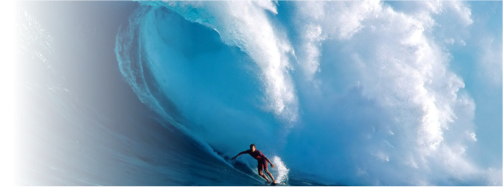
to catch the next
big wave?
We have the technology
to get you riding the crest
some technical
assistance?
We can provide
the support you need

make websites look
more personal
So we stuck
some in
this banner

is a buzzword...
Big or small?
We really can help
manage, record, report & mine
your petabytes

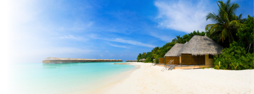
to work from from
somewhere sunsoaked?
We build applications
you can reach
from anywhere
engines
like us
We can get them
liking you too

ahead of
your competition
We have the skillset
to get you flying

to do more
than wet the surface?
We can help you
negotiate the
the rapidly changing bla bla

random action shot.
No, not me
I am here
at the keyboard
...as usual

We supply, consult
build and provision
From shared...
...to sharded

Sight is a powerful sense, and is the main sense that interacts with websites. You can control your brand image and how your customers will feel about you, with the careful use of colour. Some tips? (Note that different hues of these colours have different effects...)
Red, being the colour of fire and blood is associated with strength, power, determination and energy as well as the more romantic sides, passion, desire and love.
Red brings text and images to the foreground, so you can use it as an accent colour to stimulate people to make quick decisions. Thus, it is a perfect colour for 'Buy Now' or 'Click Here' buttons. In advertising, red is often used to evoke erotic feelings e.g. red lips, red nails, and red-light districts. Of course, it is also used to indicate danger e.g. traffic lights. As red is also associated with energy, you can use it when promoting energy drinks, games, cars, items related to sports and high physical activity.
Light red can represent joy, sexuality, passion, sensitivity, and love.
Pink signifies romance, love, and friendship. It is feminine and can be a very passive colour.
Dark red is associated with willpower, rage, anger, vigour, leadership, courage, longing, malice, and wrath.
Brown suggests stability and denotes masculine qualities.
Reddish-brown is associated with autumn and earthiness.
Orange combines the energy of red and the joy of yellow. Orange represents enthusiasm, determination, attraction, success, fascination, happiness, creativity, encouragement, and stimulation. To the human eye, orange is a hot colour, so it gives the impression of warmth. As a citrus colour, orange is associated with healthy food. You can use it to catch attention and highlight the most important elements of your design, without being too overt, as with red. Orange is very effective for promoting food products and toys.
Dark orange can mean deceit and distrust, but is also autumnal.
Red-orange corresponds to desire, pleasure, domination, aggression, and thirst for action.
Gold evokes the feeling of prestige and quality. The meaning of gold is wisdom, wealth and illumination.
Yellow is bright and is the colour of sunshine; therefore, it's associated with joy, happiness, intellect, and energy. Use yellow to evoke pleasant, cheerful feelings. Yellow can also be used to highlight the most important elements of your design, but avoid overusing it as it can be garish. It can be perceived as a children’s colour. Yellow is an unstable and spontaneous colour, so avoid using yellow if you want to suggest stability and safety. Light yellow tends to disappear into white, so it usually needs a dark colour to highlight it. Shades of yellow can be visually unappealing as they lose cheerfulness and become dingy.
Dull (dingy) yellow represents decay, sickness, and jealousy.
Light yellow is associated with freshness, and joy.
Green is considered the colour of nature. It symbolizes growth, freshness, and fertility. Dark green is also commonly associated with money. Green, as opposed to red, means safety, for example for use in traffic lights. Being associated with nature, you can use it to promote environmentally friendly products.
Dark green is associated with ambition and greed (money).
Yellow-green can indicate sickness, cowardice, and jealousy.
Aqua is associated with emotional healing and protection.
Olive green is the traditional colour of peace.
 Blue is the colour of the sky and sea and therefore, is often associated with depth and stability. IT is strongly associated with tranquillity and calmness. It is a clean colour and often allows for a clear design. As opposed to the emotionally warm colours like red, orange, and yellow; blue is unobtrusive. It can also suggest precision when promoting high-tech products. It is also considered masculine and corporate. Avoid using blue when promoting food and cooking, because blue suppresses appetite. When used together with warm colours like yellow or red, blue can create high-impact, vibrant designs e.g. Superman’s outfit, however, blue and red together can be disturbing to look at.
Light blue is associated with health, healing, tranquillity, understanding, and softness.
Dark blue represents knowledge, power, masculinity, and seriousness.
Purple combines the stability of blue and the energy and passion of red. It is a regal colour and therefore symbolizes power, nobility, and luxury. Purple is associated with wisdom, dignity, independence, creativity, and mystery. It is however also considered to be artificial. Light purple is a good choice for a feminine design or for promoting children's products.
White is associated with light, goodness, innocence, and purity. It is considered to be the colour of perfection. In advertising, white is associated with coolness and cleanliness, so you can use white to suggest simplicity in high-tech products. White or off-white is good for website backgrounds as it allows your content to take centre-stage. Minimalists love white.
Black is associated with power, elegance, formality, death, and mystery. Black gives the feeling of perspective and depth, but a black background does diminish readability, so be careful how you use it. Black contrasts very well with bright colours, for example, combined with red or orange, an aggressive colour scheme is formed.